
Part 1 : Exploratory Committee.
Greetings! It’s been a while, has it not? I started writing the blog post almost 2 years ago exactly to the day and, well, I think it should be posted because I think it can put a little bit of language to a process that often feels a bit magical. It also shows the amount of work that goes into a project and details the process of how I went from an idea to a winning design. A lot of what I’m writing describes the process as it happened, before I won the contest so the language speaks in the tense of those moments and I tried to point out things that have changed since then. So…here goes:
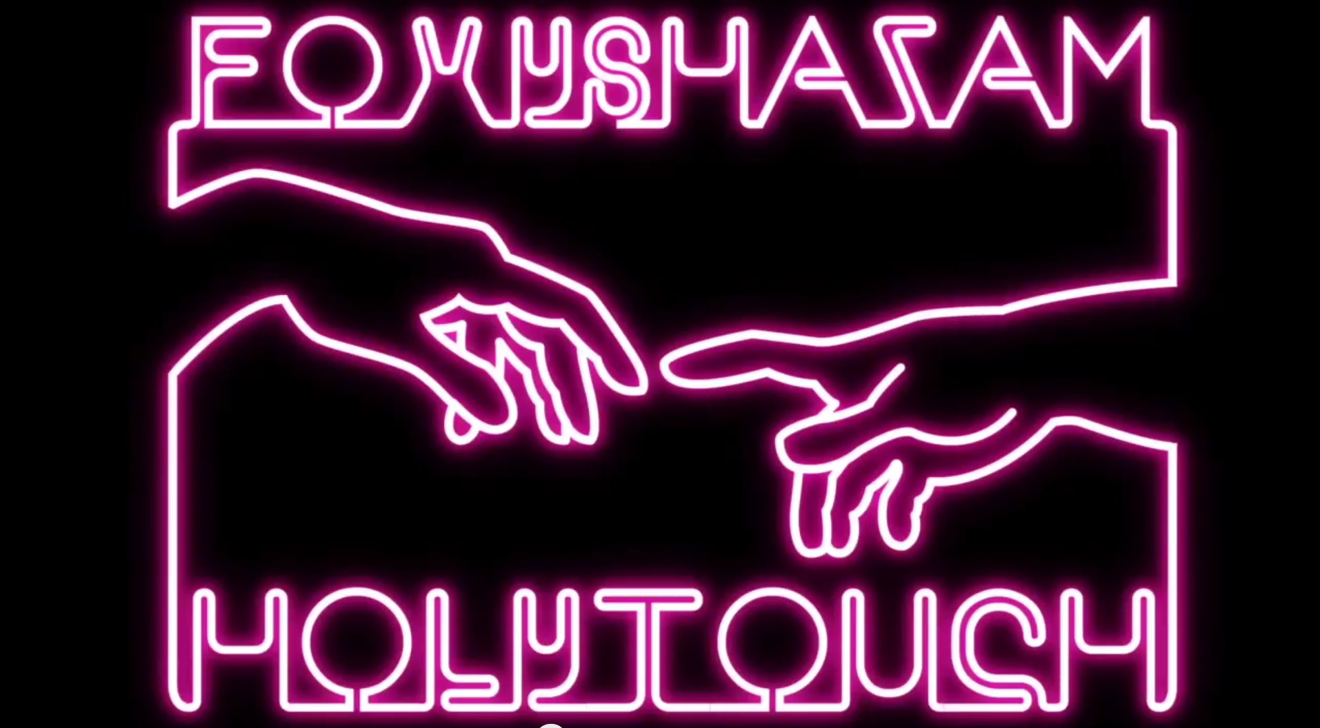
I’m going to go with something a little different today. Less homey & antiquey and I’m just going to go into art mode here. I’m a huge fan of the band Foxy Shazam and was completely excited to hear that they were hosting a contest through Creative Allies to design their next shirt promoting their new single “Holy Touch“. I got right on it. Typically I don’t enter these contests…but…being a huge fan and being a designer, I had to win this.
(update: I won this).
I entered it more as a fan than a designer. I really put everything I had into coming up with a design that would win or at the very least, get some attention. And, interestingly enough, as I write this, I was just informed that I was a finalist winner so that’s a good step in the right direction
(update: it was a step in the right direction)
On Your MarkOne of the luxuries of taking public transportation to work everyday is I could make it a productive. As busy as things are, it really is a genuine privilege to just literally have to sit down and be still for an hour a day. I used this time for my pre-production which is one of my favorite parts of the design process. To me, I’ve found this to be THE most important step for me in creating. To me, good ideas aren’t just low hanging fruit. If I went with one of the first things I thought of, that’s likely the I really want to work and wrestle with as many different ideas in as many different directions as I can and then narrow it down. I’ll go through dozens and dozens if not hundreds of very rough scribbles & sketches to get passed all of the cliche’ ideas and get to the ideas that are underneath those.

doodling my way through to the winning design…
It also helped that I was already acquainted with the band’s catalog beforehand so I could draw on looks & themes that they’ve already approved. Every album, photo & video that the band puts out is a little visual clue as to what they like and the music, of course, is a HUGE indicator of any look or feel.
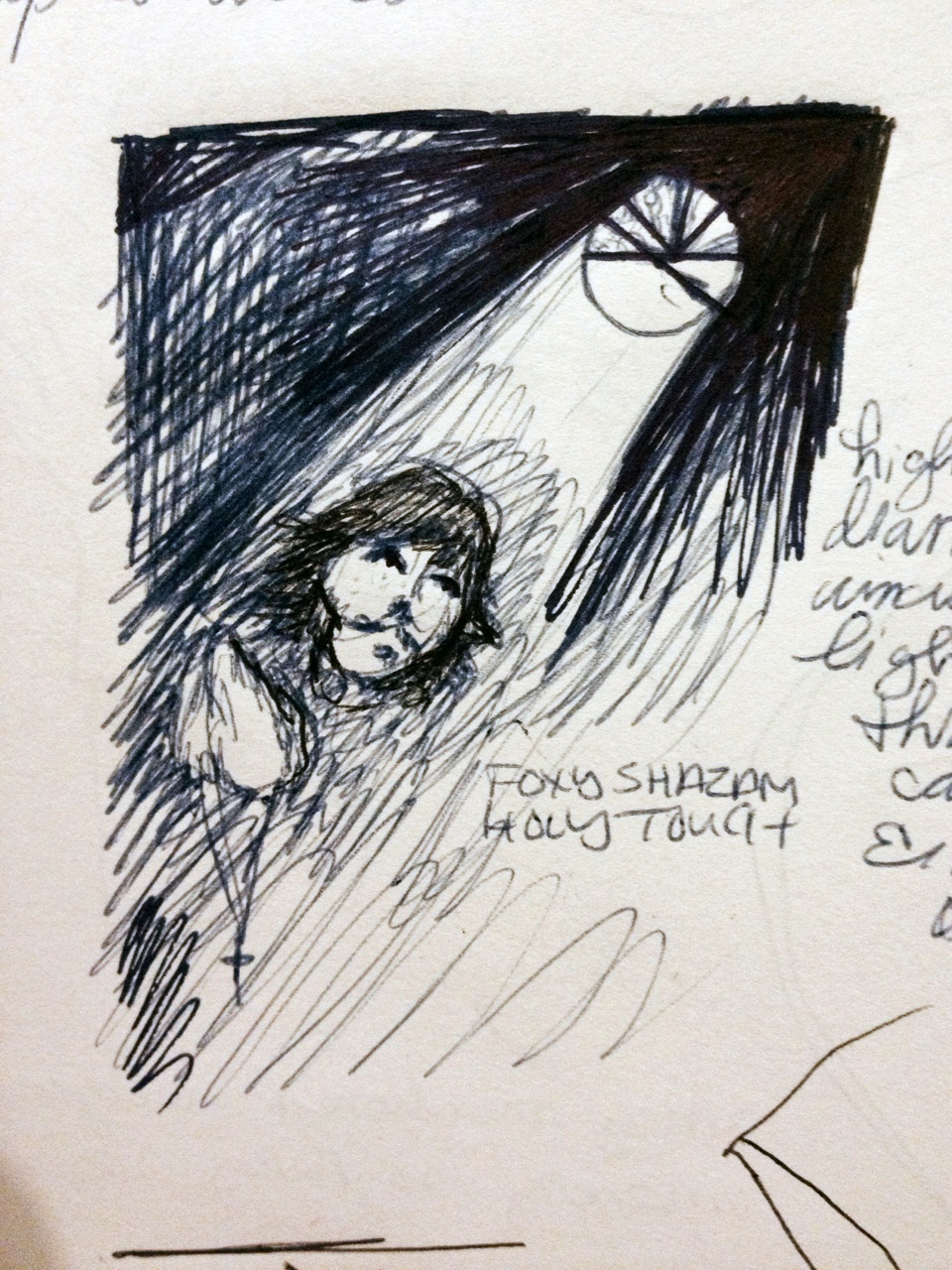
Honing in on the design. The iconic broken window makes an appearance early on in the sketches. Eric looks heavenward with rock’n’rosary in hand.
I went through a long process of working things out on pen and paper before I even started on a computer. I had to get through “easy” ideas that I figured a lot of people would think of in order to get to more meaty ideas that were behind them. The shirt’s purpose is to promote Foxy Shazam’s newest single/video called “Holy Touch”. Mind you the video didn’t come out until a week before the contest ended so none of the designers had a clue where the band was intending take the “Holy Touch” concept themselves.
Without any direction, I had to consider how I would represent Foxy Shazam representing “Holy Touch”. Because they were the first things I thought of I figured crosses, rosaries, & Michelangelo’s ‘The Creation of Adam” would show up often in people’s designs. It’s not that these elements are no good – I did several designs using these very elements in fact – but I had to thoroughly explore the idea before I could entertain the thought of returning to those first ideas. My experience has also taught me that more often than not my strongest ideas come at the end when I’ve already felt I’ve long exhausted all my options. I make it a practice to keep pushing myself to explore & create even after I literally hit a wall and can’t come up with any new directions to take it. I was planning on going with one solid design that I’d hang my hat on but if I had any other ideas along the way I’d throw them into the pool as well.
At some point I thought of the iconic broken circular stained glass that appears in the background of Foxy Shazam’s “I Like It” music video which you can see here:

An iconic broken window.
The whole motif of the album as a whole was this idea that there’s a “Church of Rock’n’Roll” and this building in the video is said to be it. Having seen the band live several times I also noticed that the drummer Aaron McVeigh has a graphic of this very window on his bass drum head.

That’s the biggest bass drum I’ve ever seen…and I like it.
Taking this project seriously and truly treating Foxy Shazam as a client, and not having the luxury of talking with them, I of course should make careful note of what they like & how they’ve represented themselves in the past and the fact that they’ve used this image several times tells me that something about it speaks to them and has resonated with them and if I do something using this window, it will hopefully resonate with them as well. So it was settled. I would go about recreating this window. How I would use it, I didn’t know – but I knew that I wanted it to be featured in the design somehow. In addition to seeing Foxy Shazam as a client, I also realized that it was a competition and taking the time to recreate this exact window wouldn’t be a simple task and other designers might not take on so I went ahead with it.
A few minutes of internet sleuthing and I figured out that the church in the music video was 150+ year old First German Reformed Church in the band’s hometown of Cincinnati, Ohio. I also learned that the band’s keyboard player Sky White also is a co-owner of the church as well so I definitely knew that this place was near and dear to some hearts in the band so I was very confident that I was going the right direction by using it. In researching the church I also recreated some of the less iconic side windows in the church that don’t really appear in the video. I didn’t end up using those in the final design but my intent was to, if I used them, let the ‘client’ know that I did my homework and came into this project more than prepared.

One of dozens of sketches: The stained-glass window gets prime real-estate here but the idea ( Nuns with guns behind Rev. Eric Nally) is too much of a derivative of their ‘I Like It” video. Keep on keepin’ on.
Though Foxy Shazam’s music is hard to pigeonhole, there’s definitely something nostalgic about it. The glamour, the excess, & the tongue-in-cheek rock spectacle is fresh but familiar . When singer Eric Nally describes his musical influences he usually doesn’t list musicians but rather thoughts, feelings, smells or experiences, oftentimes associated with childhood. So that got me thinking of what I personally find nostalgic and familiar. Comic books.

One of the first rough thumbnail sketches for the comic book concept shirt
I started out with a more the idea to do 1950’s pulp horror comic meets Rocky Horror Picture show (an idea I would’ve come nowhere near had I stopped at my first few ideas for sure). Singer Eric Nally with a bloody rubber glove & doctor’s scrubs falling revealing a priest’s collar underneath & people/the band running in terror? Drippy, spooky lettering? I liked the idea but I felt it didn’t really have it’s finger on the band’s pulse. It was almost there but not quite. As I mentioned I really wanted to take my cues from what I knew of the band at that point but also, in the spirit of the music itself, take some chances. So there’s a line that I had to walk without the benefit of being able to ‘check in’ with the band to make sure I was on point with them. I felt the horror pulp comic was the smallest bit off target but I loved where it was going. I decided to bring it around towards the highly entertaining, oftentimes goofy comics of the 1970’s & 80’s because I think that really ‘landed’ with what the band is like…vintage flavored, dramatic, and a whole ….lot…. of…. fun.
While I was playing around with this idea, thinking of music and comics, what came to mind was a very convincing comic spoof I’d seen of Rick James being drawn into an old Incredible Hulk cover. It was perfect ‘vibe’ and I felt like it hit the nail on the head and was exactly the tone I wanted for my design. They hadn’t represented themselves with comic books before or even mentioned them but putting them together, I felt like the guy who first put peanut butter & chocolate together must’ve felt. That was the ‘taking a chance’ part of the exploration. This was the direction that I was going to head. I could’ve done the shotgun approach and just made as many designs as I could, submit them all, and pray that one hit the target. I did entertain this thought briefly but I felt that was not the wisest way to go about things. Since I had the time to think about this I was going to approach it as thoughtfully as possible. In the end, I think the shotgun approach wouldn’t have really sharpened my craft or enhanced my tools in any way. It might’ve shown that I was fast and able to think of many good ideas, I find more value in not only going the distance and investing developing a great idea and but also committing to that idea.

It’s hard to mess up
anything when combining 80’s icons & comic books.
That being said, I did have a few of what I considered good ideas and, along the way I would do a quick design of them and submit them. I treated them as an exercise and if they involved more than a few minutes to design or if they detracted any time my main design. Here’s one of them:
It was an idea but I never claimed it was a good.
As you can tell it was a simple design that didn’t take more than a few minutes to create but it wasn’t the least bit smart or clever and though it might stand out a little amongst the plethora of riffs on Michelangelo’s ‘The Creation of Adam“, it was by no means on the cusp of ‘why-didn’t-I-think-of-that” territory, which is where I think great ideas should reside. Simple & smart takes the cake in my book. This was simple but not necessarily smart.

.jpg)